MAE / MFE Density
What it is
The MAE / MFE Density chart is the density version of the MAE / MFE scatter plot. It applies a 2D kernel density estimate to show where trades concentrate in MAE/MFE space — revealing the typical excursion profile of your strategy rather than individual trade outcomes.
Where the scatter plot shows every individual trade, the density view makes the underlying statistical shape visible, particularly useful when high trade counts make the scatter hard to read.
How to access it
Navigate to the MAE/MFE Density tab in the Strategy Analytics popup. Available on Plus and above.
The Strategy Analytics popup is accessed via the table icon in the View Panel after your backtest completes. See The Strategy Panel & View System for full details.
What you see
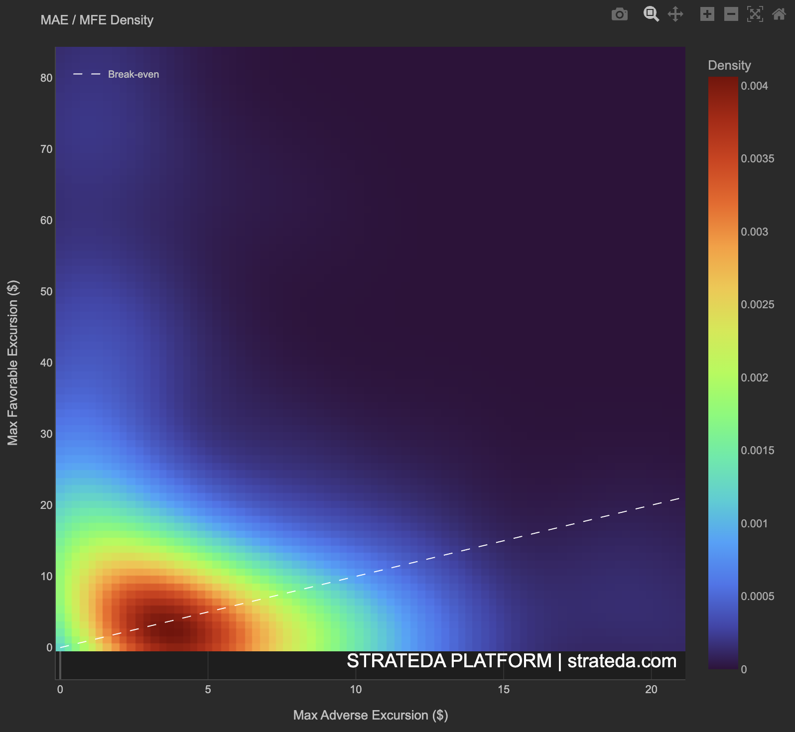
- X-axis — Max Adverse Excursion ($) — how far the trade moved against you at its worst point before closing.
- Y-axis — Max Favorable Excursion ($) — how far the trade moved in your favour at its best point before closing.
- Color — Density value. Red/orange = highest trade concentration; blue = moderate; purple/black = sparse.
- Color scale — Labeled "Density" on the right, ranging from 0 to the peak density value.
- Dashed white diagonal line — Break-even line where MAE = MFE. Density above this line represents trades where favorable movement exceeded adverse movement at some point during the trade's life.
How to interpret it
Hot spot in the upper-left (low MAE, higher MFE)
The majority of trades experienced limited adverse movement but meaningful favorable movement. This is the ideal density profile — trades move in your favour more than against you. The strategy has a positive edge ratio on a typical basis, not just on average.
Hot spot straddling the break-even line at low values
Most trades have similar small MAE and MFE — they don't move much in either direction. This is common for strategies with tight exits or during low-volatility periods. Check whether these trades are contributing meaningfully to overall P&L.
Hot spot below the break-even line
The majority of trades experience more adverse than favorable movement. Even if some trades are ultimately profitable (they closed above entry), the typical trade spends more time underwater than in profit. Consider whether stop-loss placement or entry timing could be improved.
Density spreading right along the X-axis (high MAE, low MFE)
A significant mass of trades takes large adverse excursions without corresponding favorable movement. These are trades that hurt — they move against you substantially before being closed. This pattern suggests either stops are too wide or the entry signal has low directional accuracy.
Relationship to MAE / MFE scatter
The MAE/MFE Density and MAE / MFE tabs show the same data in different forms. Use the scatter (MAE / MFE) to identify individual problematic trades and outliers. Use the density (MAE/MFE Density) to understand the statistical shape of the full population — the typical excursion experience rather than the extremes.
Example
MAE / MFE Density for 200 trades on a DEMA/EMA crossover on EURCHF M30:
- Primary hot spot: Deep red cluster at MAE 80, MFE 150 — positioned above the break-even line. The typical trade moves further in favour than against.
- Secondary warm region: Orange extending upward along the Y-axis at low MAE (30) — trades that moved strongly in favour with minimal adverse excursion. These are the cleanest wins.
- Cold region below the break-even line: Purple/sparse at MAE 50 — trades that experienced large adverse movement without corresponding favorable movement. These are rare but costly.
Interpretation: The density peak sitting above the break-even line confirms a positive edge ratio — the typical trade moves further in your favour than against you. The secondary warm region along the Y-axis (low MAE, high MFE) represents the strategy's cleanest trades. The sparse cold region below the line represents the worst-case trades that stop-losses protect against. Cross-reference with the MAE / MFE scatter to inspect individual trades in the cold region and determine whether tighter stops would have improved outcomes.