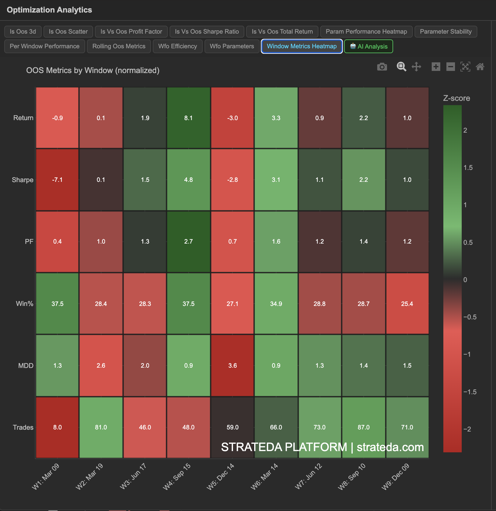
OOS Metrics Heatmap (Normalized)
What it is
The OOS Metrics Heatmap displays multiple performance metrics for every walk-forward window in a single view, with values normalized to z-scores so that different metrics (which have different natural scales) can be compared on a common color scale. This gives you a comprehensive picture of each window's quality at a glance — which windows were strong across the board, which were weak, and whether specific metrics tell a different story than others.
How to access it
Navigate to the OOS Heatmap tab in the WFO analytics popup. Available on Premium plans.
The WFO analytics popup is accessed via the table icon in the View Panel after your WFO job completes. See The Strategy Panel & View System for full details.
What you see
A multi-row heatmap where:
- Columns — Each column is one WFO window (Window 1, Window 2, ..., Window 7).
- Rows — Each row is one performance metric: Return, Sharpe Ratio, Profit Factor, Win Rate, Max Drawdown, and Trade Count.
- Cell color — Z-score normalized. Warm colors (green/yellow) indicate above-average performance for that metric; cool colors (red/blue) indicate below-average. Neutral color indicates near-average.
- Cell values — The actual metric value is displayed within each cell, with the color providing the relative context.
Z-score normalization means each metric is compared against its own mean and standard deviation across windows. A Return z-score of +1.5 means that window's return was 1.5 standard deviations above the average return across all windows.
How to interpret it
Reading columns (individual windows)
Each column gives you a complete picture of one window's quality:
- All-green column — That window was strong across every metric. A uniformly good period.
- All-red column — That window underperformed on all fronts. Likely a regime mismatch.
- Mixed column — Some metrics were good, others were poor. Investigate: for example, high return but low win rate might indicate a few large winning trades (momentum capture).
Reading rows (individual metrics)
Each row shows how one metric varies across time:
- Uniform row (all similar color) — That metric is consistent across windows. The strategy performs similarly in that dimension regardless of time period.
- Variable row — That metric fluctuates. Investigate which market conditions cause the variation.
Key patterns
Max Drawdown row consistently green, Return row mixed: The strategy controls risk well even in weak windows. Good sign for live deployment — you may not always profit, but drawdowns are contained.
Win Rate stable, Return variable: The strategy wins at a consistent rate, but the size of wins varies. This often occurs with trend-following strategies where most wins are small and a few are large.
Trade Count varies significantly: Different windows generate very different numbers of trades. This could affect the statistical reliability of windows with low trade counts — check that high-metric windows aren't simply low-trade-count windows with lucky outcomes.
Example
OOS Metrics Heatmap for a 7-window DEMA/EMA crossover WFO:
| Metric | W1 | W2 | W3 | W4 | W5 | W6 | W7 |
|---|---|---|---|---|---|---|---|
| Return | +1.8% | +2.1% | −0.4% | +0.6% | +1.5% | +2.3% | +1.1% |
| Sharpe | 0.92 | 1.15 | −0.18 | 0.35 | 0.88 | 1.32 | 0.71 |
| PF | 1.62 | 1.78 | 0.92 | 1.15 | 1.55 | 1.84 | 1.41 |
| Win % | 76% | 78% | 72% | 74% | 77% | 79% | 75% |
| Max DD | 0.8% | 0.6% | 1.2% | 0.9% | 0.7% | 0.5% | 0.8% |
| Trades | 138 | 145 | 132 | 141 | 148 | 152 | 140 |
Window 3 would show cool colors (red) across Return, Sharpe, and PF, but neutral-to-warm on Win Rate and Trade Count — indicating the losing window wasn't caused by poor signal quality or insufficient data, but rather by a regime where small losses accumulated despite a reasonable win rate. Window 6 is all-green — the strongest period by every measure.