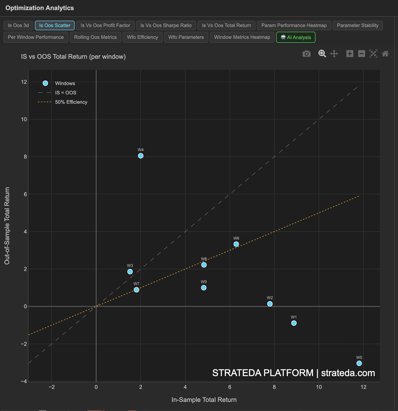
IS vs OOS Scatter (Efficiency Analysis)
What it is
The IS vs OOS Scatter plot places each walk-forward window as a point on a 2D plane, with in-sample return on the x-axis and out-of-sample return on the y-axis. Two reference lines provide context: the IS = OOS diagonal (perfect efficiency — OOS matches IS exactly) and the 50% efficiency line (OOS is half of IS). This view reveals the relationship between training and testing performance across all windows simultaneously.
How to access it
Navigate to the IS vs OOS Scatter tab in the WFO analytics popup. Available on Premium plans.
The WFO analytics popup is accessed via the table icon in the View Panel after your WFO job completes. See The Strategy Panel & View System for full details.
What you see
- Each dot represents one WFO window, positioned by its IS return (x) and OOS return (y).
- IS = OOS diagonal — A 45° line where OOS exactly equals IS. Points above this line mean OOS outperformed IS (rare but possible). Points below mean OOS underperformed IS (expected).
- 50% efficiency line — A line at half the slope of the diagonal. Points above this line have at least 50% walk-forward efficiency.
- Quadrants — The upper-right quadrant (positive IS, positive OOS) is where you want most points. Points in the lower-right quadrant (positive IS, negative OOS) indicate overfitting — good training, failed testing.
How to interpret it
Tight cluster in upper-right quadrant, near or above 50% efficiency line: Strong result. Most windows had positive IS and positive OOS, with reasonable efficiency. The strategy concept generalizes consistently.
Spread along the IS axis but clustered near zero on OOS axis: IS performance varies (some windows optimize better than others), but OOS consistently fails to capture the IS edge. This is a classic overfitting pattern.
Points scattered across multiple quadrants: No consistent relationship between IS and OOS. The optimizer finds different things in each window, and none of them generalize reliably. Weak strategy concept.
One outlier far from the cluster: A single window that dramatically outperformed or underperformed. Investigate — it may correspond to an extreme market event. The cluster is more informative than the outlier.
Linear trend (points form a rough line with positive slope): Good sign. It means that when IS is stronger, OOS tends to be stronger too — a consistent relationship between training and testing performance.
Example
A 7-window WFO scatter for a DEMA/EMA crossover:
- 5 points sit in the upper-right quadrant (positive IS, positive OOS), clustered between the 50% efficiency line and the IS = OOS diagonal.
- 1 point is in the lower-right quadrant — IS was strong (+7.1%) but OOS was slightly negative (−0.4%). This is the regime-affected Window 3.
- 1 point is in the upper-right quadrant but below the 50% efficiency line — IS was very strong (+4.9%) but OOS captured only +0.6%.
The overall pattern shows a clear positive relationship between IS and OOS, with most windows above the 50% efficiency threshold. The single below-zero OOS point doesn't dominate the picture.