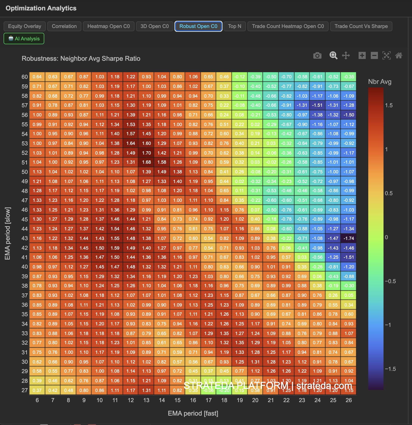
Robustness Analysis (Neighbor Averaging)
What it is
Robustness Analysis applies neighbor averaging to the optimization results. Instead of showing the raw Sharpe ratio for each parameter combination, each cell displays the average Sharpe of that combination and its immediate neighbors in the parameter grid. This smoothing technique filters out isolated high-performing outliers and reveals which parameter regions are genuinely stable.
The logic is simple: if a parameter combination is truly good, its neighbors should also perform reasonably well. A combination that scores 1.8 while its neighbors score 0.2 is almost certainly overfitting. A combination that scores 1.4 with neighbors scoring 1.0–1.6 is far more trustworthy.
How to access it
Navigate to the Robust Open C0 tab in the optimization analytics popup. Available on Plus plans and above.
The optimization analytics popup is accessed via the table icon in the View Panel after your optimization job completes. See The Strategy Panel & View System for full details.
What you see
A 2D heatmap similar to the Parameter Heatmap, but with smoothed values:
- Each cell shows the neighbor-averaged Sharpe ratio rather than the raw value.
- Averaging method — Each cell is averaged with its adjacent neighbors (up, down, left, right, and diagonals in the parameter grid).
- Color scale — Same warm-to-cool mapping as the standard heatmap, but the values are smoothed.
The visual effect is that isolated bright cells in the raw heatmap will dim in the robustness view (their high score gets diluted by poor neighbors), while cells within genuinely strong clusters will retain their warmth.
How to interpret it
Comparing raw heatmap to robustness heatmap:
This comparison is the core analytical step. Look at the same parameter region in both views:
- Stays bright in both views — Genuinely robust. The combination and its neighbors all perform well. This is where you want to select your parameters.
- Bright in raw, dim in robustness — Fragile. The raw score was high, but neighboring parameters perform poorly. This combination is likely overfitting and should not be trusted.
- Dim in raw, brighter in robustness — Part of a solid neighborhood. The raw score was modest but consistent with its neighbors. Worth considering as a conservative choice.
What to look for:
- The brightest region in the robustness heatmap should align with a broad warm cluster in the raw heatmap. If they diverge significantly, be skeptical of the raw results.
- The robustness heatmap should have fewer extreme values and a smoother gradient than the raw heatmap. If it still shows sharp contrasts, the underlying pattern is strong.
Example
Comparing raw and robustness heatmaps for a DEMA × EMA optimization on BTC:
- Raw heatmap — Highest cell is EMA 35 / DEMA 15 with Sharpe 1.82.
- Robustness heatmap — Highest cell shifts to EMA 30 / DEMA 20 with neighbor-averaged Sharpe 1.38. The original best cell drops to 1.35 after averaging.
The small difference between these two cells in the robustness view (1.38 vs 1.35) confirms both are in the same stable region. The trader selects EMA 30 / DEMA 20 — slightly lower raw Sharpe but the most robust choice, sitting at the center of the highest-averaged neighborhood.