Optimization Analytics
What it is
The Optimization Analytics popup provides multiple views of your parameter grid search results. It opens via the global table icon at the bottom of the View Panel after an optimization job completes. The left panel displays whichever analytics tab is currently selected. The right panel shows the Optimization Summary Statistics table at all times, regardless of which tab is active — giving you a persistent reference to aggregate metrics while you explore the visual analytics.
How to access it
Once an optimization run finishes, the best parameter combination's equity curve loads automatically in the View Panel. The remaining combinations and all analytics views are accessible via the table icons.
Two table icons give access to different views:
-
Global table icon (at the bottom of the View Panel) — Opens the full optimization analytics popup with all tabs: heatmaps, 3D surface, robustness analysis, equity overlay, and summary statistics. This is the primary analytics entry point for optimization results.
-
Local table icon (on the individual equity curve entry in the View Panel) — Opens the single backtest metrics popup for that specific parameter combination — the same metrics view as a regular backtest. Use this to inspect the full metrics table for the best combination specifically.
For full details on how the table icons work across different result types, see The Strategy Panel & View System.
Available on Plus plans and above.
What you see
When an optimization job completes, the best-ranked parameter combination (by your chosen metric) loads automatically as an equity curve in the View Panel. The full analytics popup is then accessible via the global table icon at the bottom of the View Panel.
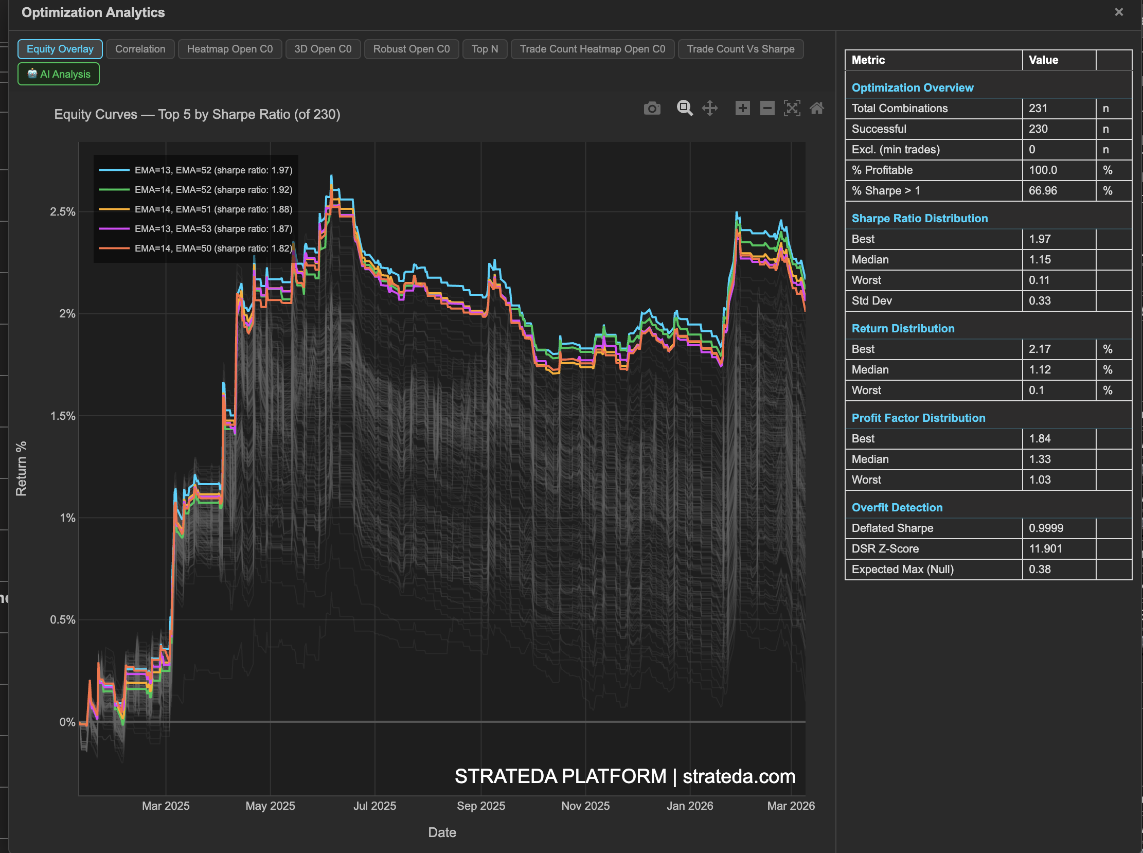
The popup is divided into two panels. The left panel displays whichever analytics tab is currently selected. The right panel shows the Summary Statistics table at all times, regardless of which tab is active — giving you a persistent reference to aggregate metrics while you explore the visual analytics.
Analytics Tabs
The results are presented across multiple views, each accessible via its own tab:
- Equity Overlay — All combinations plotted simultaneously
- Correlation — Metric correlation matrix across all combinations
- Heatmap Open C0 — 2D Sharpe ratio grid across parameter pairs (Open signal, Condition 0)
- 3D Open C0 — Interactive rotatable 3D surface plot
- Robust Open C0 — Neighbor-averaged performance grid
- Top N — Ranked bar chart of best parameter sets
- Trade Count Heatmap Open C0 — Trade count heatmap across parameter pairs
- Trade Count Vs Sharpe — Scatter plot of trade count vs Sharpe ratio with min-trade threshold
- AI Analysis — AI-generated interpretation (coming soon)
Tabs labelled "Open C0" refer to the Open signal, Condition 0 — the first condition of your open signal. Strategies with multiple conditions will show additional condition tabs.
The Summary Statistics panel is always visible on the right side of the popup, regardless of which tab is selected.
Example
After optimizing a DEMA × EMA crossover on BTC with 400 combinations:
- Summary Statistics shows 62% of combinations are profitable, median Sharpe is 0.45, best Sharpe is 1.82.
- Heatmap reveals a cluster of high-Sharpe cells in the EMA 25–40 / DEMA 10–20 region.
- Robustness Analysis confirms the cluster holds up after neighbor averaging.
- The trader selects EMA 30 / DEMA 15 — in the center of the stable high-performance region identified by the heatmap and robustness views.