Temporal Slippage Patterns
What it is
Temporal Slippage Patterns reveals when your execution quality is best and worst by mapping slippage across hour of day and day of week. Different market sessions have different liquidity characteristics — and your broker's fill quality may vary accordingly. This view shows whether your live execution data reflects time-based patterns, and how significant the difference is for your specific strategy and broker.
How to access it
Navigate to Temporal Patterns in the Execution Quality dashboard. Available on Pro and Premium plans.
What you see
A heatmap where:
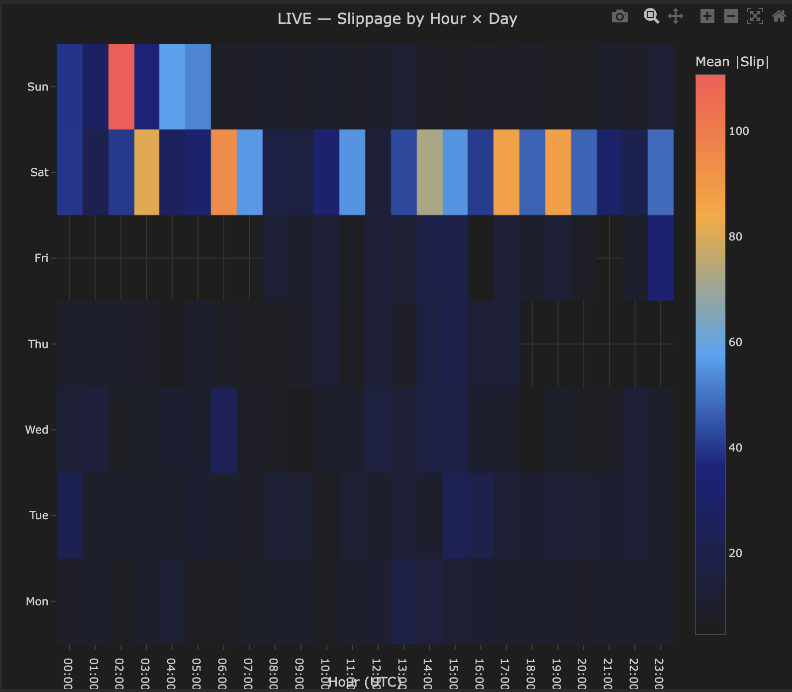
- X-axis — Hour of day (UTC), 00:00–23:00.
- Y-axis — Day of week, Monday through Sunday — weekend rows appear for instruments that trade 24/7 such as crypto.
- Color scale — Mean |Slip| (absolute slippage in price units). Warm colors (orange/red) indicate higher average absolute slippage; dark blue indicates low slippage or no data.
- Cell values — The exact average absolute slippage value for each time slot.
- Empty cells indicate no trades were executed during that hour/day combination — useful for understanding when your strategy is actually active.
How to interpret it
The liquidity cycle
The pattern you see depends entirely on your instrument and broker. Crypto instruments like BTCUSD trade 24/7 and often show higher slippage during weekend hours when liquidity is thinner. Forex pairs typically show higher slippage during the Asian session and around session transitions. The heatmap shows YOUR execution reality — use it to identify your worst windows, not to match a theoretical pattern.
The table below shows typical session liquidity as a general reference only — your actual results will vary by instrument, broker, and strategy timing. This applies primarily to forex pairs; crypto patterns differ significantly.
| Time (UTC) | Liquidity | Expected slippage |
|---|---|---|
| 07:00–08:00 | London open — increasing | Moderate |
| 08:00–12:00 | London session — high | Low (best) |
| 12:00–16:00 | London/NY overlap — highest | Lowest |
| 16:00–21:00 | NY session — high | Low |
| 21:00–00:00 | NY close — decreasing | Moderate to high |
| 00:00–07:00 | Asian session — low | Highest (worst) |
What to look for
Clear hour-of-day pattern (expected): Slippage is systematically higher during low-liquidity hours and lower during high-liquidity hours. This is market microstructure at work and is normal. The actionable insight is how much worse — if overnight slippage is 3× daytime slippage, restricting your strategy to liquid hours may meaningfully improve net performance.
Day-of-week pattern: Monday opens and Friday closes often have wider spreads. If your heatmap shows meaningfully worse slippage on Monday mornings or Friday afternoons, consider whether your strategy generates signals during these periods and whether avoiding them improves net results.
No clear pattern: Either your trade sample is too small to detect patterns (need 200+ trades across different time slots), or your broker provides genuinely uniform execution quality. The latter is a positive finding.
Actionable decisions
The temporal heatmap directly informs strategy scheduling:
- If overnight slippage is 2–3× daytime slippage and your strategy trades 24 hours, calculate whether restricting to 08:00–20:00 UTC improves net P&L despite fewer trades.
- If Monday morning is consistently bad, delaying strategy activation to Monday afternoon costs few signals but saves on execution.
These are quantifiable decisions — the heatmap gives you the numbers to make them.
Example
Temporal slippage heatmap for BTCUSD live strategy:
- Saturday 00:00–05:00 UTC — consistently highest slippage (warm orange cells) — weekend liquidity is significantly thinner for crypto during these hours.
- Weekday daytime (Mon–Fri, 06:00–20:00 UTC) — mostly dark blue, low slippage — deepest liquidity period for BTCUSD.
- Empty cells — no trades executed during those time slots.
Interpretation: This strategy's worst execution windows are Saturday early hours. Whether to restrict trading during these hours depends on whether those trades are profitable despite higher slippage costs — the heatmap identifies the cost, not whether avoiding those hours improves overall performance. Cross-reference with the P&L by Time chart in the Strategy Analytics section to make that decision.